
Jede Region einfärben
Die Farbintensität trägt den Wert. Richtig für Raten, Anteile und Pro-Kopf-Werte, die bereits um Größe und Bevölkerung bereinigt sind.
Vorlage öffnenA blank Indiana county map to print, and a builder to fill it with your own data. Download the free outline of all 92 counties, or upload a spreadsheet and publish an interactive Indiana map you can embed anywhere.
Alle 92 counties als saubere Umrisskarte. Ausdrucken, ausmalen oder in ein Dokument einfügen — ohne Konto, ohne Namensnennung.
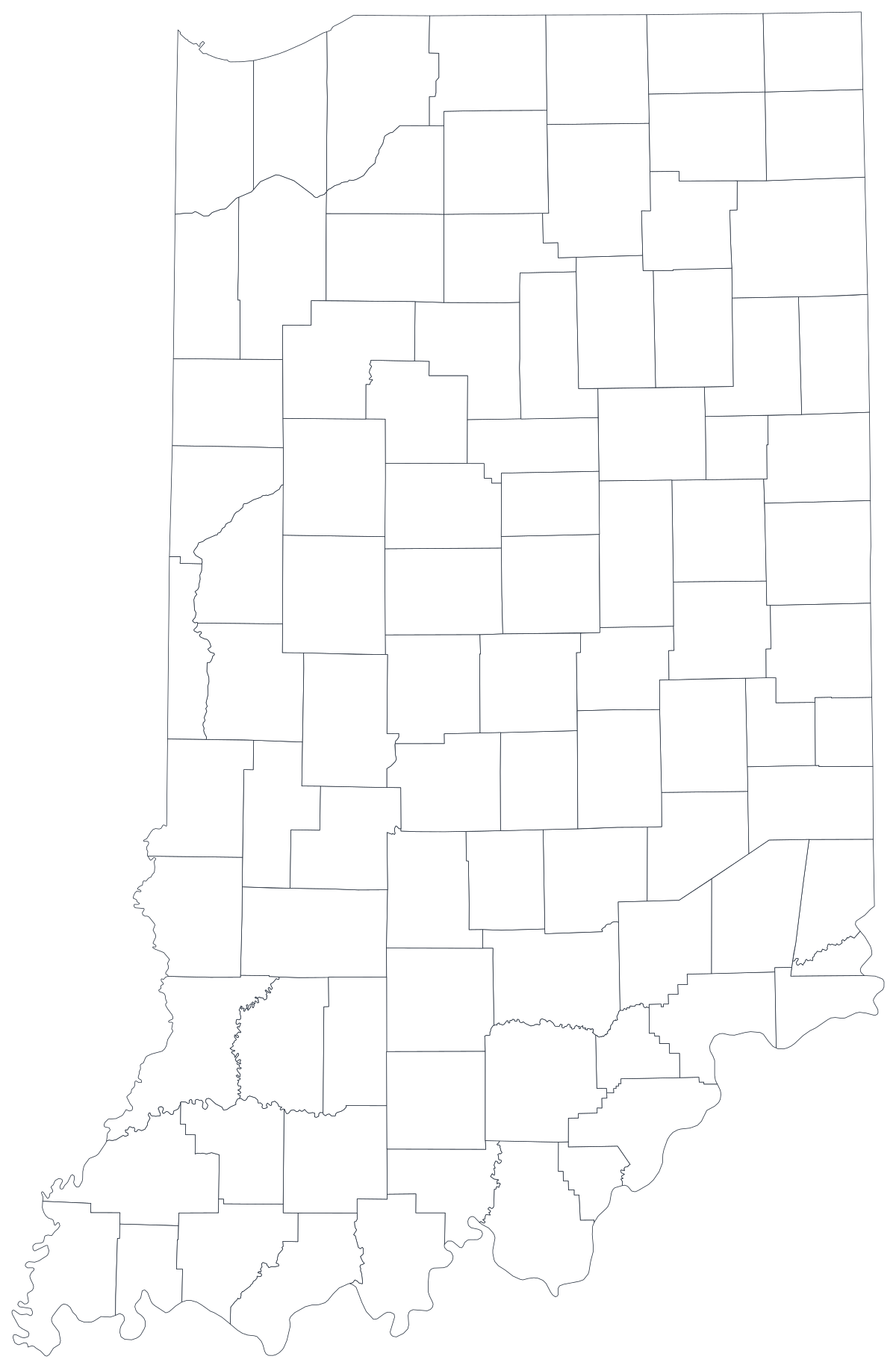
Frei für jede Nutzung, auch kommerziell und im Unterricht. Erzeugt aus denselben Grenzen, die der Editor verwendet.
SVG herunterladenIndiana divides into 92 counties, and almost everything the state measures is reported at that level — unemployment, overdose deaths, school enrolment, corn and soybean yields, turnout, broadband coverage. Unlike the western states, Indiana's counties are small and fairly even in size, which makes a county map here read more like a grid than like a landscape: no single shape dominates the picture the way a desert county does out west. What varies is the population inside them. Marion County holds Indianapolis, the seven counties ringing it hold the fastest growth in the state, and the far northwest corner belongs to Chicago more than it belongs to Indianapolis — three facts a county map shows at once.
Regionen einfärben, wenn die Zahl eine Rate ist; einen Marker skalieren, wenn sie eine Anzahl ist. Diese Verwechslung ist der häufigste Grund, warum eine Datenkarte in die Irre führt.
Die Farbintensität trägt den Wert. Richtig für Raten, Anteile und Pro-Kopf-Werte, die bereits um Größe und Bevölkerung bereinigt sind.
Vorlage öffnenEin Symbol pro Region, skaliert nach Wert. Für Anzahlen und Summen, bei denen eine Flächenfärbung nur die Bevölkerungskarte nachzeichnen würde.
Vorlage öffnenKreise, deren Größe den Wert trägt, über dem Umriss. Gut, wenn wenige Regionen dominieren und kleine in einer Flächenfarbe untergehen würden.
Vorlage öffnenIndiana Department of Health indicators, Department of Workforce Development labour figures, Department of Education enrolment, USDA crop statistics and Secretary of State election returns are all published by county.
Unemployment rate, overdose deaths per 100,000, share of adults with a bachelor's degree, share of the vote, median household income. Rates are already adjusted for population, which is exactly what shading a region needs.
Hamilton, Hendricks, Johnson, Boone, Hancock, Morgan and Shelby ring Marion County, and on most economic measures they look nothing like the county at the centre. That contrast is a ring on a map and a paragraph in prose.
Classroom work, county extension materials, planning workshops, colour-by-hand exercises. The free outline above prints cleanly at any size.
Shade by a raw count and Marion County wins every time, with Lake and Allen behind it. Anything that grows simply because more people live somewhere belongs on a sized symbol, not a shade.
Fort Wayne, Evansville and South Bend each sit inside a county that is larger than the city, and Indiana's school corporations cross county lines freely. Mapping either onto counties will misplace the thing you are describing.
Lake, Porter and LaPorte belong to the Chicago metro; Clark and Floyd belong to Louisville. If that is the comparison, use the US county map so the reader can see across the border instead of stopping at it.
Rural county samples are small and suppressed cells are common in health data. A map with sixty grey shapes and thirty-two coloured ones is a worse bar chart — rank the counties you do have.
Von der Tabelle zur veröffentlichten Karte, Schritt für Schritt.
The free outline above is a plain SVG of all 92 counties — print it, or drop it into a document. To build with data, open the PlotSet Indiana (counties) template, which comes with sample data already bound.
One row per county: the county name or its five-digit FIPS code in the first column, your number in the second. FIPS codes for Indiana all begin 18.
Import a CSV or Excel file, paste from a spreadsheet, or connect a Google Sheet so the map can be refreshed when the source updates.
Shade the counties for a rate, or switch to symbols or bubbles for a count. Same geography, same data, different encoding.
Sequential for a low-to-high measure, diverging only when a real midpoint exists — the state average, zero change, a 50 per cent line. Four to six steps read more precisely than a smooth gradient.
Publish for a live interactive map with a tooltip on every county, or export a PNG, SVG or PDF for a report or a deck.
Starten Sie mit der Indiana-Vorlage samt Beispieldaten und ersetzen Sie diese durch Ihre eigenen.
Vorlage öffnenWie die Ortsspalte aussehen muss und wo es Daten gibt, die bereits passen.
The ones that break a join are the run-together names: LaPorte, LaGrange, DeKalb and Vanderburgh are written as one word by the state and as two — or misspelled "Vanderburg" — by nearly everyone else. St. Joseph carries a full stop. Tippecanoe, Wabash and Kosciusko are frequently mistyped.
Unigov consolidated the two in 1970, so city figures and county figures are usually the same number. They are not always: Beech Grove, Lawrence, Southport and Speedway kept their own governments inside the county, so some municipal series exclude them and some do not.
18001 is Adams, 18183 is Whitley. Store the column as text so the codes keep their shape, and remember the county part is odd-numbered rather than sequential.
Most of the state is Eastern; a dozen counties in the northwest and southwest run on Central time. Any dataset with a timestamp — hospital admissions, 911 calls, poll closing times — needs to say which zone it is in before the county map means anything.
STATS Indiana at the Indiana Business Research Center is the usual first stop; the Indiana Department of Health, the Department of Workforce Development, the Department of Education and the Census Bureau's ACS all publish county tables directly.
It produces a population map every time: dark at Indianapolis, dark in the northwest corner, pale across the farm counties. Anything that grows with population should be a sized symbol.
Indiana's smallest county by area is called Ohio, and Kentucky and West Virginia have counties of the same name. A national dataset joined on name alone will scatter its rows across three states.
Ohio, Switzerland, Blackford, Vermillion and Union are tiny on the page. If one of them is the story, label it directly or add an inset — a reader will not find a two-pixel shape on their own.
Health and education releases blank out small counts for privacy. Import those cells as empty rather than as 0, or the sparsest counties will read as the healthiest ones on the map.
A sequence of hues has no natural order, so readers cannot tell high from low without checking the legend on every county. Use one hue, light to dark.
Yes. The outline above is a free SVG of all 92 Indiana counties — right-click to save it, print it, or drop it into a worksheet or document. No account needed.
Tabelle hochladen und in wenigen Minuten eine interaktive Karte veröffentlichen — kostenlos, ohne Kreditkarte.