
Colorer chaque région
L'intensité de la couleur porte la valeur. Le bon choix pour les taux, les parts et les données par habitant, déjà ajustés à la taille ou à la population.
Ouvrir le modèleA blank Colorado county map to print, and a builder to fill it with your own data. Download the free outline of all 64 counties, or upload a spreadsheet and publish an interactive Colorado map you can embed anywhere.
Les 64 counties, en tracé net. Imprimez-le, coloriez-le ou insérez-le dans un document — sans compte et sans attribution.
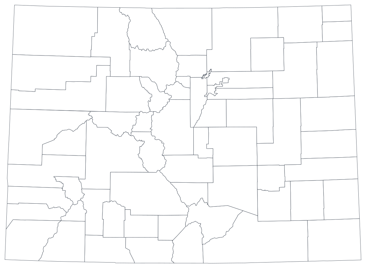
Libre pour tout usage, y compris commercial et scolaire. Généré à partir des mêmes contours que l'éditeur.
Télécharger le SVGColorado divides into 64 counties, and the map splits into three plainly different countries. A narrow strip along the Front Range — Denver, Boulder, Jefferson, Adams, Arapahoe, Douglas, El Paso, Larimer, Weld and Pueblo — holds the large majority of the state's people in a small share of its area. West of that, the mountain and Western Slope counties are drawn around river basins and divides, big on the page and thin on population, with resort economies that look nothing like the counties next to them. East of it, the plains counties are rectangles ruled out on a grid, agricultural, and emptier every census. Almost every Colorado county map is really a picture of that three-way split, whatever the underlying measure happens to be.
Colorez les régions pour un taux, dimensionnez un marqueur pour un effectif. Inverser les deux est la façon la plus courante de tromper le lecteur.
L'intensité de la couleur porte la valeur. Le bon choix pour les taux, les parts et les données par habitant, déjà ajustés à la taille ou à la population.
Ouvrir le modèleUn symbole par région, mis à l'échelle selon la valeur. À utiliser pour les effectifs et les totaux, là où colorer la surface ne ferait que redessiner la carte de la population.
Ouvrir le modèleDes cercles dimensionnés par la valeur, posés sur le tracé. Efficace quand quelques régions dominent et que les petites disparaîtraient dans un aplat.
Ouvrir le modèleCDPHE health indicators, Department of Labor and Employment figures, Department of Education enrolment, State Demography Office population estimates and Secretary of State election returns are all published by county.
Unemployment rate, uninsured share, housing cost burden, share of the vote, median household income. Rates are already adjusted for population, which is exactly what shading a region needs.
The corridor from Fort Collins to Pueblo is where the people, the jobs and the growth are. On a county map it is a vertical band, and everything either side of it is a different argument.
Classroom work, extension and county-fair materials, planning workshops, colour-by-hand exercises. The free outline above prints cleanly at any size.
Shade by a raw count and the map becomes a picture of the Front Range: dark from Fort Collins to Colorado Springs, pale everywhere else. Use symbols or bubbles sized by the count instead.
Denver is a county, but Colorado Springs, Fort Collins, Boulder and Aurora are not — and Aurora sits in three counties at once. Colorado's school districts also cross county lines. Mapping either onto counties will misplace what you are describing.
Roughly a third of Colorado is federal land, and it is not distributed by county boundary. Wildfire, grazing, recreation and water measures often follow watersheds, forests or the Continental Divide, and a county map cuts across all of them.
San Juan, Hinsdale, Mineral and Jackson counties have populations in the hundreds to low thousands, so suppressed cells are routine in health and education releases. A map that is mostly grey is a worse bar chart — rank the counties you do have.
Du tableur à la carte publiée, étape par étape.
The free outline above is a plain SVG of all 64 counties — print it, or drop it into a document. To build with data, open the PlotSet Colorado (counties) template, which comes with sample data already bound.
One row per county: the county name or its five-digit FIPS code in the first column, your number in the second. FIPS codes for Colorado all begin 08 — including the leading zero.
Import a CSV or Excel file, paste from a spreadsheet, or connect a Google Sheet so the map can be refreshed when the source updates.
Shade the counties for a rate, or switch to symbols or bubbles for a count. Same geography, same data, different encoding.
Sequential for a low-to-high measure, diverging only when a real midpoint exists — the state average, zero change, a 50 per cent line. Four to six steps read more precisely than a smooth gradient.
Publish for a live interactive map with a tooltip on every county, or export a PNG, SVG or PDF for a report or a deck.
Partez du modèle Colorado avec ses données d'exemple, puis remplacez-les par les vôtres.
Ouvrir le modèleÀ quoi doit ressembler la colonne des lieux, et où trouver des données déjà compatibles.
The state code is 08, so every county code is five characters starting with a zero — 08031 is Denver, 08123 is Weld. Open that column as a number and Excel silently turns 08031 into 8031, which joins to nothing. Import the column as text, every time.
The City and County of Broomfield, FIPS 08014, was carved out of Adams, Boulder, Jefferson and Weld. Any series that reaches back past 2001 either has no Broomfield row or has one that is not comparable with the years around it, and the four donor counties change shape at the same break.
The City and County of Denver is a single consolidated government, so city figures and county figures are the same number. Neighbouring Aurora is the opposite case — it spans Arapahoe, Adams and Douglas, and its city totals do not belong to any one county.
Las Animas, Rio Blanco, Rio Grande, San Juan, San Miguel, Saguache, Huerfano, Conejos, Costilla, Ouray and La Plata are all easy to mistype or to collapse into one word. San Juan and San Miguel are two different counties, as are Rio Blanco and Rio Grande.
The State Demography Office at DOLA is the usual first stop for population and economic series; CDPHE, the Department of Labor and Employment, the Department of Education, the Secretary of State and the Census Bureau's ACS all publish county tables directly.
It draws the Front Range and nothing else, every single time. Anything that grows simply because more people live somewhere should be a sized symbol, not a shade.
Las Animas, Moffat, Garfield and Rio Blanco cover enormous areas and hold very few people. On a shaded map they take visual weight their populations do not justify, because a reader's eye reads area as importance — say so in the caption.
Pitkin, Summit, Eagle and San Miguel have small permanent populations, large seasonal ones and extreme housing costs. Per-capita measures there are computed on a denominator that is not really the population using the county.
With several counties under a thousand residents, health and education releases blank out small counts as a matter of course. Import those cells as empty rather than as 0, or the emptiest counties will read as the healthiest ones on the map.
A sequence of hues has no natural order, so readers cannot tell high from low without checking the legend on every county. Use one hue, light to dark.
Yes. The outline above is a free SVG of all 64 Colorado counties — right-click to save it, print it, or drop it into a worksheet or document. No account needed.
Importez un tableur et publiez une carte interactive en quelques minutes — gratuit, sans carte bancaire.