
Shade each region
Colour intensity carries the value. The right choice for rates, shares and per-capita figures, which are already adjusted for how big or populous a region is.
Open the templateA blank Arizona county map to print, and a builder to fill it with your own data. Download the free outline of all 15 counties, or upload a spreadsheet and publish an interactive Arizona map you can embed anywhere.
All 15 counties, as a clean outline. Print it, colour it in, or drop it into a document — no account and no attribution required.
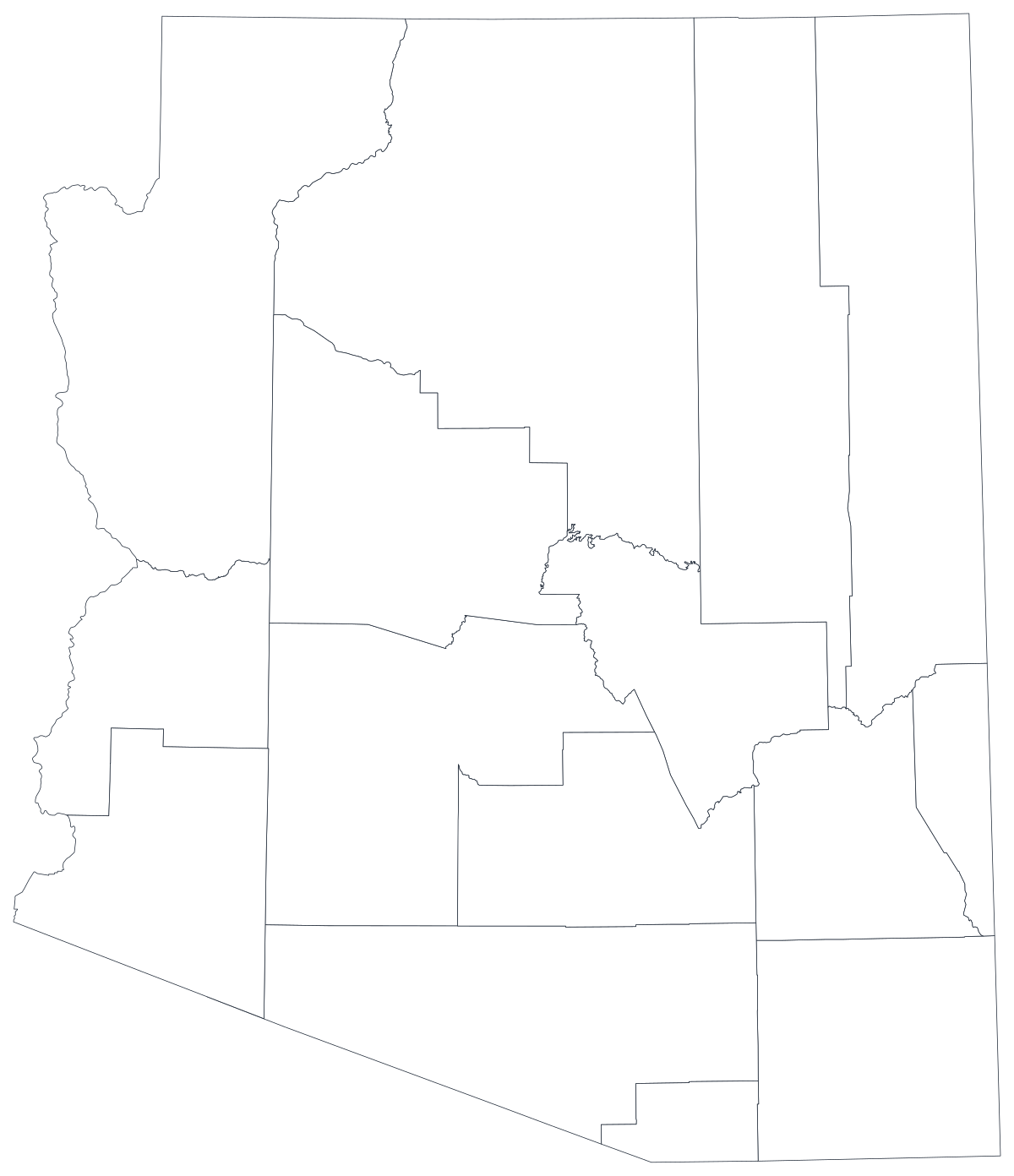
Free for any use, including commercial and classroom. Generated from the same boundaries the builder uses.
Download SVGArizona divides into just 15 counties, one of the smallest counts in the country, and they are enormous. Coconino County alone is bigger than nine US states; Mohave, Apache and Navajo run in long strips from the Utah border deep into the interior. That makes an Arizona county map unusually easy to read — fifteen shapes, all labellable, no cluster of tiny eastern-seaboard counties to squint at — and unusually easy to mislead with. Roughly six in ten Arizonans live in Maricopa County, and Maricopa plus Pima accounts for around three quarters of the state. So the map has one shape that is nearly the whole population and fourteen that are mostly land, and any measure that scales with people will simply redraw that fact. The interesting Arizona maps are the ones that resist it: rates rather than counts, and a colour scale that lets Greenlee and La Paz say something even though almost nobody lives there.
Shade the regions when your number is a rate, size a marker when it is a count. Getting this backwards is the most common way a data map misleads.
Colour intensity carries the value. The right choice for rates, shares and per-capita figures, which are already adjusted for how big or populous a region is.
Open the templateOne symbol on each region, scaled by value. Use it for counts and totals, where shading the land area would just redraw the population map.
Open the templateCircles sized by value, sitting over the outline. Reads well when a few regions dominate and small ones would otherwise disappear into a shade.
Open the templateArizona Department of Health Services indicators, Office of Economic Opportunity labour figures, Department of Education enrolment and Secretary of State election returns are all published by county.
Unemployment rate, uninsured share, heat-related deaths per 100,000, share of the vote. Rates are already adjusted for population, which is exactly what shading a region needs.
With 15 regions, every county can carry a label at a normal size. That is rare for a state map and it makes Arizona a good geography for a printed page or a slide.
Classroom exercises, field planning, colour-by-hand sessions. The free outline above prints cleanly at any size.
Shade by a raw count and Maricopa wins every time — it holds around 62 per cent of the state's people. Use symbols or bubbles sized by the count instead.
Maricopa is one shape whether Scottsdale and Maryvale look alike or nothing alike, and it contains more people than fourteen counties combined. Below the county line, use ZIP codes, census tracts or municipal boundaries.
The Navajo Nation spans Apache, Navajo and Coconino counties, and the Tohono O'odham Nation sits inside Pima and Pinal. County shapes cut straight through those communities, so county data will not describe them.
With 15 regions, three grey shapes is 20 per cent of the map missing. If coverage is patchy, rank the counties you do have rather than publishing a map full of holes.
From a spreadsheet to a published map, step by step.
The free outline above is a plain SVG of all 15 counties — print it, or drop it into a document. To build with data, open the PlotSet Arizona (counties) template, which comes with sample data already bound.
One row per county: the county name or its five-digit FIPS code in the first column, your number in the second. FIPS codes for Arizona all begin 04.
Import a CSV or Excel file, paste from a spreadsheet, or connect a Google Sheet so the map can be refreshed when the source updates.
Shade the counties for a rate, or switch to symbols or bubbles for a count — which on this geography is usually the honest choice, because it keeps Maricopa's size visible without letting it colour the whole state.
Sequential for a low-to-high measure, diverging only when a real midpoint exists — the state average, zero change, a 50 per cent line. Four to six steps read more precisely than a smooth gradient.
Publish for a live interactive map with a tooltip on every county, or export a PNG, SVG or PDF for a report or a deck.
Start from the Arizona template with sample data already loaded, then swap in your own.
Open the templateWhat the place column has to look like, and where to find data that already matches.
Apache, Cochise, Coconino, Gila, Graham, Greenlee, La Paz, Maricopa, Mohave, Navajo, Pima, Pinal, Santa Cruz, Yavapai, Yuma. La Paz is two words. Mohave has no 'j' — that spelling belongs to the Mojave Desert, not the county.
They are adjacent, they differ by one letter, and transposing them is the single most common Arizona data error. Pima holds Tucson; Pinal is the fast-growing corridor between Tucson and Phoenix.
04001 is Apache, 04027 is Yuma. Store the column as text so the leading zero survives — a spreadsheet that helpfully turns 04013 into 4013 will break every join in the file.
It was split from Yuma County in 1983, the most recent new county in the United States. Any historical series before that has 14 counties, and Yuma's older figures include what is now La Paz.
The Arizona Department of Health Services, the Office of Economic Opportunity, the Department of Education, the Secretary of State and the Department of Water Resources all publish county tables, as does the Census Bureau's ACS.
It produces a picture of Maricopa County every time. Anything that grows simply because more people live there should be a sized symbol, not a shade.
Coconino is the second-largest county in the contiguous United States and holds around 150,000 people. On a shaded map it occupies a fifth of the state and shouts louder than Maricopa. Say so in the caption, or use bubbles.
Arizona's state code is 04, so every county code starts with a zero that Excel will strip on import. Format the column as text before you open the file, not after.
Apache, Graham, Navajo, Santa Cruz and Yuma all exist elsewhere — Santa Cruz is also a California county. If your table covers more than Arizona, join on FIPS.
A sequence of hues has no natural order, so readers cannot tell high from low without checking the legend on every county. Use one hue, light to dark.
Yes. The outline above is a free SVG of all 15 Arizona counties — right-click to save it, print it, or drop it into a worksheet or document. No account needed.
Upload a spreadsheet and publish an interactive map in a couple of minutes — free, no credit card.