
Shade each region
Colour intensity carries the value. The right choice for rates, shares and per-capita figures, which are already adjusted for how big or populous a region is.
Open the templateA blank New York county map to print, and a builder to fill it with your own data. Download the free outline of all 62 counties, or upload a spreadsheet and publish an interactive New York map you can embed anywhere.
All 62 counties, as a clean outline. Print it, colour it in, or drop it into a document — no account and no attribution required.
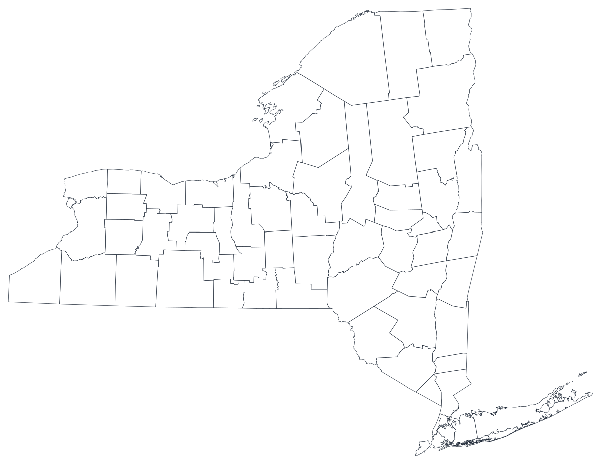
Free for any use, including commercial and classroom. Generated from the same boundaries the builder uses.
Download SVGNew York State divides into 62 counties, and five of them are the boroughs of New York City — Bronx, Kings (Brooklyn), New York (Manhattan), Queens and Richmond (Staten Island). Those five occupy about one three-hundredth of the state's land and hold about four in ten of its people, which is the single fact that governs every New York county map ever drawn: the places with the most going on are the ones you can barely see. Beyond the city the map opens out fast — the suburban ring of Nassau, Suffolk, Westchester and Rockland, the Hudson Valley, the Capital District around Albany, the Adirondack counties in the north, and the western tier through Syracuse, Rochester and Buffalo. Most New York maps are, whatever else they measure, a picture of that downstate-upstate divide.
Shade the regions when your number is a rate, size a marker when it is a count. Getting this backwards is the most common way a data map misleads.
Colour intensity carries the value. The right choice for rates, shares and per-capita figures, which are already adjusted for how big or populous a region is.
Open the templateOne symbol on each region, scaled by value. Use it for counts and totals, where shading the land area would just redraw the population map.
Open the templateCircles sized by value, sitting over the outline. Reads well when a few regions dominate and small ones would otherwise disappear into a shade.
Open the templateDepartment of Health indicators, Department of Labor figures, NYSED enrolment and graduation data, Board of Elections returns and Cornell's population projections are all published by county.
Unemployment rate, uninsured share, rent burden, share of the vote, median household income. A rate is already adjusted for how many people live in a place, which is exactly what shading a region needs.
It is the state's oldest argument and the county map makes it without a caption — twelve counties around the city against fifty across the rest of the state, holding roughly two thirds of the population between them.
Fourth-grade New York State studies, county-by-county labelling exercises, planning workshops, colour-by-hand work. The free outline above prints cleanly at any size.
The five boroughs are too small on a state map to read, and half the state's datasets report them as one "New York City" row anyway. If the city is the subject, use a five-borough map or a ranked bar chart instead.
Shade a raw count and the map draws five tiny dark shapes at the mouth of the Hudson and nothing else. Use symbols or bubbles sized by the count — a bubble over Kings County is visible when Kings County is not.
Buffalo is smaller than Erie County, Rochester smaller than Monroe, and New York's roughly seven hundred school districts do not nest inside counties. Forcing any of them onto county shapes will misplace what you are describing.
Hamilton County has around five thousand residents, and Schuyler, Yates and Lewis are all under thirty thousand, so suppressed cells are common in health releases. A map that is mostly grey is a worse bar chart — rank the counties you do have.
From a spreadsheet to a published map, step by step.
The free outline above is a plain SVG of all 62 counties — print it, or drop it into a worksheet. To build with data, open the PlotSet New York (counties) template, which comes with sample data already bound.
One row per county: the county name or its five-digit FIPS code in the first column, your number in the second. New York's state code is 36, so every county code starts 36 and no leading zero can be lost.
The map's five city shapes are Bronx, Kings, New York, Queens and Richmond. If your file says Brooklyn, Manhattan or Staten Island, translate those three before you upload, or they will not join.
Import a CSV or Excel file, paste from a spreadsheet, or connect a Google Sheet so the map can be refreshed when the source updates.
Shade the counties for a rate, or switch to symbols or bubbles for a count — the second option is what rescues the boroughs, because a sized circle over Manhattan is readable when the island itself is a few pixels.
Publish for a live interactive map with a tooltip on every county, or export a PNG, SVG or PDF for a report or a deck.
Start from the New York template with sample data already loaded, then swap in your own.
Open the templateWhat the place column has to look like, and where to find data that already matches.
Brooklyn is Kings County, Manhattan is New York County and Staten Island is Richmond County; only the Bronx and Queens match. Census files, health data and this map's geometry all use the county names, while journalism and city agencies use the borough names, so one of the two sides of your join usually needs translating.
The state, the city and New York County — which is Manhattan alone, not the city. A row labelled "New York" in a county file is Manhattan; a row labelled "New York" in a state file is the whole state. Confusing the two puts eight million people on one island.
The Department of Health, the Board of Elections and several education releases publish "New York City" as a single row rather than five county rows. That row cannot be drawn on a county map without a decision: split it by population, show the five boroughs as one merged shape, or leave them out and say so.
It appears as St. Lawrence, St Lawrence and Saint Lawrence across different sources, and this map's geometry carries it as Saint Lawrence. It is the largest county in the state by area, so a failed join there leaves a conspicuous hole in the north.
Cornell's Program on Applied Demographics is the usual first stop for population estimates and projections; the Department of Health, the Department of Labor, NYSED, the Board of Elections and the Census Bureau's ACS all publish county tables directly.
Kings County alone has more residents than fifteen US states, in an area you could lose behind a legend. Shade a raw count and the map says nothing except that people live in the city. Use a sized symbol for anything that grows with population.
St. Lawrence, Hamilton, Herkimer and Essex cover an enormous share of the paper and hold a tiny share of the people. On a shaded map they dominate visually, because readers read area as importance — say so in the caption, or use bubbles.
A file that says Brooklyn and Manhattan leaves two grey shapes in the densest part of the state, and the map looks like a data-coverage failure rather than a naming mismatch. Translate borough names to county names before uploading.
Hamilton County's population is about five thousand, so health and education releases blank out small counts there routinely. Import those cells as empty rather than as 0, or the emptiest county in the state will read as the healthiest.
A sequence of hues has no natural order, so readers cannot tell high from low without checking the legend on every county. Use one hue, light to dark.
Yes. The outline above is a free SVG of all 62 New York counties — right-click to save it, print it, or drop it into a worksheet or document. No account needed.
Upload a spreadsheet and publish an interactive map in a couple of minutes — free, no credit card.