
Colorear cada región
La intensidad del color transporta el valor. La opción correcta para tasas, porcentajes y cifras per cápita, ya ajustadas al tamaño o la población.
Abrir la plantillaA blank Alabama county map to print, and a builder to fill it with your own data. Download the free outline of all 67 counties, or upload a spreadsheet and publish an interactive Alabama map you can embed anywhere.
Los 67 counties, con un trazado limpio. Imprímelo, coloréalo o insértalo en un documento — sin cuenta y sin atribución.
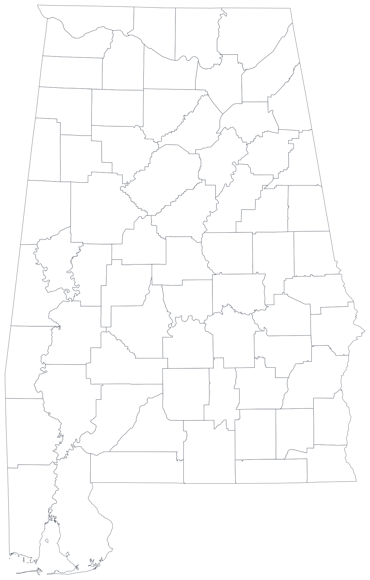
Libre para cualquier uso, incluidos el comercial y el educativo. Generado a partir de los mismos límites que usa el editor.
Descargar SVGAlabama divides into 67 counties, and three things shape almost every map drawn on them. Around eight counties hold roughly half the state's population — Jefferson around Birmingham, Madison around Huntsville, Mobile, Baldwin on the coast, Montgomery, Shelby, Tuscaloosa and Lee — and they are not clustered together. Across the middle and south of the state runs the Black Belt, a band named for its dark prairie soil and now the state's poorest, most rural and most heavily Black group of counties; it shows up on health, income, broadband and turnout maps alike. The north-east is Appalachian foothill country with its own pattern again. A statewide average for Alabama tends to sit between those regions rather than describe any of them, which is the argument for mapping the counties in the first place.
Colorea las regiones cuando tu cifra es una tasa; dimensiona un marcador cuando es un recuento. Invertirlo es la forma más común de que un mapa engañe.
La intensidad del color transporta el valor. La opción correcta para tasas, porcentajes y cifras per cápita, ya ajustadas al tamaño o la población.
Abrir la plantillaUn símbolo por región, escalado según el valor. Úsalo para recuentos y totales, donde colorear la superficie solo redibujaría el mapa de población.
Abrir la plantillaCírculos dimensionados por el valor sobre el contorno. Funciona bien cuando unas pocas regiones dominan y las pequeñas se perderían en un color.
Abrir la plantillaAlabama Department of Public Health indicators, Department of Labor employment figures, State Department of Education enrolment and report-card data, and Secretary of State election returns are all published by county.
Uninsured rate, broadband subscription share, share of the vote, median household income. A rate is already adjusted for population, which is exactly what shading a region needs.
It is a geographic band, so it is invisible in a ranked list and unmistakable on a map. Anything measuring rural access, health outcomes or income in Alabama will show it.
Classroom exercises, county-by-county planning sessions, colour-by-hand worksheets. The free outline above prints cleanly at any size.
Shade by a raw count and Jefferson County wins every time — it holds around one in eight Alabamians. Use symbols or bubbles sized by the count instead.
Alabama runs city school systems alongside the 67 county systems, and municipalities like Birmingham and Huntsville spill across county lines. Flattening either onto counties misplaces the thing you are describing.
Sixty grey shapes around a dozen coloured ones is a worse bar chart. If coverage is patchy, rank the counties you actually have.
If the point is how Alabama sits against Mississippi, Georgia or the South as a whole, use the US county map so the reader can see across the state line.
De la hoja de cálculo al mapa publicado, paso a paso.
The free outline above is a plain SVG of all 67 counties — print it, or drop it into a document. To build with data, open the PlotSet Alabama (counties) template, which loads with sample data already bound.
One row per county: the county name or its five-digit FIPS code in the first column, your number in the second. Alabama FIPS codes all begin 01.
Import a CSV or Excel file, paste from a spreadsheet, or connect a Google Sheet so the map can be refreshed when the source updates.
Shade the counties for a rate, or switch to symbols or bubbles for a count. Same geography, same data, different encoding.
Sequential for a low-to-high measure, diverging only when a real midpoint exists — the state average, zero change, a 50 per cent line. Four to six steps read more precisely than a smooth gradient.
Publish for a live interactive map with a tooltip on every county, or export a PNG, SVG or PDF for a report or a deck.
Empieza con la plantilla de Alabama y sus datos de ejemplo, y luego sustitúyelos por los tuyos.
Abrir la plantillaCómo debe ser la columna de lugares y dónde encontrar datos que ya coincidan.
The state code is 01, so every county code has a leading zero: 01001 is Autauga, 01133 is Winston. Store the column as text before you open the file, because a spreadsheet will read 01001 as the number 1001 and every county will then fail to join.
The Census writes DeKalb and St. Clair; the boundaries behind this map write De Kalb and Saint Clair. Both are the same county, and a name join will silently drop whichever form your file does not use. Joining on FIPS avoids the question entirely.
The same is true of Montgomery, Birmingham inside Jefferson County, and Huntsville, which sits mostly in Madison but reaches into Limestone and Morgan. City-level figures do not belong on a county map without being restated.
The Alabama Department of Public Health, the Department of Labor, the State Department of Education and the Secretary of State all publish county tables, as does the Census Bureau's American Community Survey.
It produces a population map every time. Anything that grows simply because more people live there should be a sized symbol, not a shade.
This is the single most common broken Alabama map. 01001 arrives as 1001, the join finds nothing, and the map renders blank rather than throwing an error. Import the FIPS column as text.
Different agencies draw it differently — some use twelve counties, some more than twenty. If you shade a region rather than a measure, say which definition you used.
Greene County has fewer than 8,000 residents and Jefferson has over 650,000, while Baldwin is the largest county on the page by area. Small denominators make rates jump around; note it in the caption.
A sequence of hues has no natural order, so readers cannot tell high from low without checking the legend on every county. Use one hue, light to dark.
Yes. The outline above is a free SVG of all 67 Alabama counties — right-click to save it, print it, or drop it into a worksheet or document. No account needed.
Sube una hoja de cálculo y publica un mapa interactivo en un par de minutos — gratis y sin tarjeta.