
Colorear cada región
La intensidad del color transporta el valor. La opción correcta para tasas, porcentajes y cifras per cápita, ya ajustadas al tamaño o la población.
Abrir la plantillaA blank Maryland county map to print, and a builder to fill it with your own data. Download the free outline of all 23 counties, or upload a spreadsheet and publish an interactive Maryland map you can embed anywhere.
Los 23 counties, con un trazado limpio. Imprímelo, coloréalo o insértalo en un documento — sin cuenta y sin atribución.
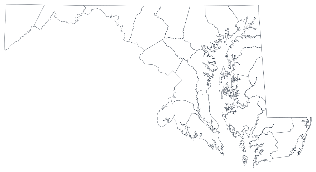
Libre para cualquier uso, incluidos el comercial y el educativo. Generado a partir de los mismos límites que usa el editor.
Descargar SVGMaryland is drawn in 23 counties, plus Baltimore City, which is not a county at all — it is an independent city that has stood outside county government since 1851, and it is the single most important thing to know before you put data on this map. The shape of the state does the rest of the explaining. Garrett and Allegany sit in the Appalachian west, closer to Ohio than to the Atlantic. The centre holds almost everyone: Montgomery and Prince George's along the District line, Baltimore County wrapped in a horseshoe around the city it no longer contains, Anne Arundel and Howard filling the space between Baltimore and Annapolis. Then the land thins out again across the Chesapeake into nine Eastern Shore counties where a whole county can hold fewer people than a Bethesda zip code. A Maryland county map is therefore a map of one dense middle and two quiet ends, and the counties in that middle are small enough on the page that a shading scale has to work hard to make them readable at all.
Colorea las regiones cuando tu cifra es una tasa; dimensiona un marcador cuando es un recuento. Invertirlo es la forma más común de que un mapa engañe.
La intensidad del color transporta el valor. La opción correcta para tasas, porcentajes y cifras per cápita, ya ajustadas al tamaño o la población.
Abrir la plantillaUn símbolo por región, escalado según el valor. Úsalo para recuentos y totales, donde colorear la superficie solo redibujaría el mapa de población.
Abrir la plantillaCírculos dimensionados por el valor sobre el contorno. Funciona bien cuando unas pocas regiones dominan y las pequeñas se perderían en un color.
Abrir la plantillaMaryland Department of Health indicators, Department of Labor unemployment figures, State Board of Elections returns, MSDE school data and the state's own open-data portal all publish by county and Baltimore City.
Median household income, uninsured rate, vaccination coverage, share of the vote, change since the last census. Rates already account for population, which is exactly what a shaded region needs.
Two metros dominate the state from opposite ends of one corridor. Montgomery and Prince George's face Washington, Baltimore County and Anne Arundel face Baltimore, and the counties between them behave like neither. Geography is the clearest way to say that.
Classroom work, canvassing plans, territory splits, colour-by-hand sessions. The free outline above prints cleanly at any size.
Most Maryland datasets report 24 jurisdictions. This geography draws 23 counties, so a city row has nowhere to land — merge it into Baltimore County and say so in the caption, or use a symbol map that can place a marker on the city.
Shade by a raw count and Montgomery and Prince George's win every time — between them they hold roughly a third of the state. Anything that grows simply because more people live there belongs on a sized symbol.
Maryland's legislative districts cross county lines freely, and while most school systems are county-wide, Baltimore City's is not. Forcing either onto counties misplaces the thing you are describing.
Montgomery County alone holds about a million people, and the difference between Silver Spring and Poolesville is invisible at this scale. Sub-county data wants zip codes, census tracts or a plain ranked table.
De la hoja de cálculo al mapa publicado, paso a paso.
The free outline above is a plain SVG of all 23 counties — print it, or drop it into a document. To build with data, open the PlotSet Maryland (counties) template, which comes with sample data already bound.
One row per county: the county name or its five-digit FIPS code in the first column, your number in the second. Maryland FIPS codes all begin 24.
Do this before you upload, not after. Either fold the city into Baltimore County and label the map accordingly, or drop the row and note the omission. A silently missing city is the most common way this map misleads.
Import a CSV or Excel file, paste from a spreadsheet, or connect a Google Sheet so the map can be refreshed when the source updates.
Shade the counties for a rate, or switch to symbols or bubbles for a count. Bubbles are often the better choice here, because the small central counties hold the large numbers.
Publish for a live interactive map with a tooltip on every county, or export a PNG, SVG or PDF for a report or a deck.
Empieza con la plantilla de Maryland y sus datos de ejemplo, y luego sustitúyelos por los tuyos.
Abrir la plantillaCómo debe ser la columna de lugares y dónde encontrar datos que ya coincidan.
Baltimore City is independent of Baltimore County and is reported separately by almost every state agency. This geography has a Baltimore County shape and no Baltimore City shape, so the two must be reconciled in your spreadsheet.
The map expects Prince George's, Queen Anne's and Saint Mary's — not Prince Georges, Queen Annes or St. Mary's. Smart quotes pasted from a document are a different character again, and a mismatch leaves a blank county rather than an error.
24001 is Allegany, 24047 is Worcester, and 24510 is Baltimore City — the odd one out, numbered in the independent-city range. Store the column as text so the leading 2 survives.
The Maryland Open Data Portal, the Maryland Department of Health, the Department of Labor, the State Board of Elections and the Census Bureau's ACS all publish county-level tables.
Join 24 rows to 23 shapes and one row vanishes quietly — and it is the row holding several hundred thousand people and, usually, the extreme value. Check your row count after the join, every time.
It produces a population map: the three counties around Washington and Baltimore glow, the Eastern Shore disappears, and the reader learns nothing they did not already know.
Garrett and Allegany are large on the page and small in population. A striking colour out there dominates a map that is mostly about the corridor, so suppress low-count counties explicitly or note the caveat in the caption.
The central counties are too small on screen for a label to fit. Label the handful your argument rests on and let the hover tooltip carry the rest.
Yes. The outline above is a free SVG of all 23 Maryland counties — right-click to save it, print it, or drop it into a worksheet or document. No account needed.
Sube una hoja de cálculo y publica un mapa interactivo en un par de minutos — gratis y sin tarjeta.